Three units at once
Enter a percentage, a milligram per deciliter figure, or a millimole per liter figure. All three appear together so nothing needs converting by hand.
Private browser-based calculator
Use the A1C Chart to translate test results into estimated average glucose, compare dated readings, and create a clear, professional trend report for printing or PDF download.
Choose a reading type and enter one value to see all three measurements and a general reference category.
Converted result
This category is a general reference and is not a diagnosis. A healthcare professional must interpret and confirm laboratory results.
Reading 0 of 24
Enter the value exactly as it appears in your record.
Reference categories are general screening ranges, not diagnoses. A healthcare professional must interpret and confirm laboratory results.
| # | Date | Label or note | Entered | A1C | eAG mg/dL | eAG mmol/L | Reference category | Change | Actions |
|---|
Your dated readings will appear here after you add them above.
Only your entered readings and their mathematical conversions will be plotted.
Ready when you are
Print and PDF contain the same calculated report — summary, colour chart and reading table.
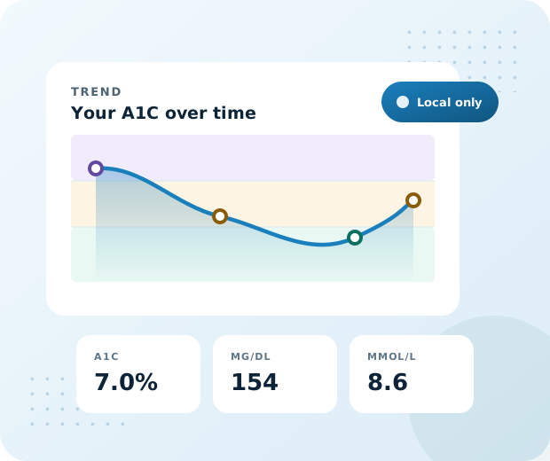
It answers two questions that lab reports tend to leave open. What does this number mean in the units I actually use, and which way has it been moving.
Type a single value in whichever unit your report shows and the tool returns the matching figures in the other two, along with the general screening band the result falls in. Add a date to that reading and it joins a running history that draws itself into a chart.
Health data belongs to the person it describes. Everything here is calculated by the browser on your own device. There is no account, no upload, and no analytics watching what you type. Saving to your device is optional and switched off until you turn it on.
Nine capabilities that turn a bare percentage into something you can read, chart, and hand to a clinician.
Enter a percentage, a milligram per deciliter figure, or a millimole per liter figure. All three appear together so nothing needs converting by hand.
A coloured scale shows exactly where your result sits across the screening bands, with a marker that slides as the value changes and a line for your own target.
Store up to twenty four readings with the date each one was collected. Edit or remove any entry, and sort the table oldest or newest first.
Your readings plot onto shaded reference bands with points coloured by category. Switch the vertical axis between all three units whenever you like.
One page holds the summary, the scale, the chart, and the full table. Browser headers are suppressed so no stray date or address prints across the top.
The export slices pages on real element boundaries so rows never split in half, and a page that would hold nothing is dropped before the file is saved.
Values are processed in memory on your device. Storage on the device is opt in, and one control clears anything that was saved.
Errors name the actual problem rather than repeating a range. Type a letter and it says so. Type a comma decimal and it simply works.
The layout adapts from a narrow phone through to a wide monitor, with touch targets sized for fingers and a table that scrolls rather than squeezes.
Converting a single reading takes about ten seconds. Building a full report takes a few minutes the first time and moments after that.
Choose whether your report shows an A1C percentage or an average glucose figure, then select the matching glucose unit if that applies.
Enter the number exactly as printed. A decimal point and a decimal comma are both accepted, so seven point five and seven comma five behave the same.
All three units appear together with a reference band and a scale marker. Add the reading to your history if you want it on the chart.
Fill in the optional report details, then send the report to a printer or save it as a colour PDF to bring to your next appointment.
A percentage and a glucose average describe the same thing in two languages. Speaking both removes a surprising amount of confusion.
A laboratory percentage and a meter average look nothing alike until one is translated. Once both sit in the same units you can finally tell whether they agree.
Milligrams per deciliter and millimoles per liter are both standard, just in different countries. Seeing both means guidance from anywhere becomes readable.
One result is a dot. Several dated results form a line, and the slope of that line usually carries more meaning than any single value along it.
Arriving with a dated, printed history lets a short consultation be spent on interpretation instead of reconstructing numbers from memory.
Every row below comes from the same relationship the calculator uses. Figures are rounded only for display.
| A1C | eAG mg/dL | eAG mmol/L | General reference category |
|---|---|---|---|
| 4.0% | 68 | 3.8 | Below 5.7% |
| 4.5% | 82 | 4.6 | Below 5.7% |
| 5.0% | 97 | 5.4 | Below 5.7% |
| 5.5% | 111 | 6.2 | Below 5.7% |
| 5.7% | 117 | 6.5 | 5.7% to 6.4% |
| 6.0% | 126 | 7.0 | 5.7% to 6.4% |
| 6.5% | 140 | 7.8 | 6.5% and above |
| 7.0% | 154 | 8.6 | 6.5% and above |
| 7.5% | 169 | 9.4 | 6.5% and above |
| 8.0% | 183 | 10.2 | 6.5% and above |
| 9.0% | 212 | 11.8 | 6.5% and above |
| 10.0% | 240 | 13.4 | 6.5% and above |
| 11.0% | 269 | 14.9 | 6.5% and above |
| 12.0% | 298 | 16.5 | 6.5% and above |
| 14.0% | 355 | 19.7 | 6.5% and above |
Categories describe where a value sits on a population screening scale. They are not a diagnosis, and a clinician must interpret any laboratory result in the context of the individual it belongs to.
Built on standard web features with graceful fallbacks, so it behaves the same across current browsers on every platform.
| Browser | Convert & chart | Print report | PDF download | Notes |
|---|---|---|---|---|
| Chrome | Full | Full | Full | Recommended for the cleanest print output |
| Edge | Full | Full | Full | Behaves identically to Chrome |
| Firefox | Full | Full | Full | Untick headers and footers in the print dialog |
| Safari on macOS | Full | Full | Full | Use the PDF button in the print sheet if preferred |
| Safari on iPhone and iPad | Full | Full | Varies | Some versions open the file rather than saving it |
| Chrome on Android | Full | Full | Full | Saves into your downloads folder |
| Samsung Internet | Full | Full | Full | Print sheet layout differs slightly |
| Internet Explorer | Not supported | Not supported | Not supported | Retired by its vendor, please use a current browser |
The PDF button loads two small libraries the first time it is pressed, so that one action needs a connection. Everything else keeps working offline once the page has loaded.
Six situations that occasionally come up, with the reason behind each one and what to do about it.
The tool accepts A1C from 3.0 to 20.0 percent and the matching glucose spans of 39.4 to 527.3 mg/dL and 2.19 to 29.29 mmol/L. Values outside those bounds fall beyond what the formula was built to describe.
Check that the unit selector matches the unit on your report. Entering a glucose figure while the percentage option is active is the usual cause.
That export pulls in two libraries on first use. If the network is unavailable or a filter is blocking them, the button falls back and offers the print route instead.
Choose print and then pick save as PDF in your printer list. The layout produced is identical because both routes share one stylesheet.
Those come from your browser rather than the report. The page already asks the browser to suppress them, but some print dialogs override that request.
Open more settings inside the print dialog and untick the option named headers and footers.
The chart only draws readings you have entered, and it never invents points between visits. A single reading appears as one marker rather than a line.
Open the history tab and add at least one dated reading. Two or more produce a line you can read a direction from.
Nothing is stored unless you tick the option to remember entries on the device. That default protects anyone using a shared or public computer.
Turn the option on before you start if you want the record to survive a refresh, and use delete saved data when you want it gone.
That gap is common and often meaningful. A meter average reflects whenever you happened to test, while the converted figure describes a full day average across months.
Read our guide on factors that shift a result, then raise a persistent difference with your clinician.
Representative feedback scenarios showing how people in the US and UK may use the tool between appointments.
These are illustrative user scenarios, not independently verified testimonials; names are abbreviated for privacy.
Short, practical explanations written to sit alongside the calculator rather than repeat it.
Twenty answers covering the conversion itself, the report, and how your data is handled.
Whichever one your report shows. Pick the matching reading type, type the number, and the other two units are filled in for you.
Yes. A single comma with no decimal point is read as a decimal separator, so seven comma five is understood as seven point five.
A1C from 3.0 to 20.0 percent, average glucose from 39.4 to 527.3 mg/dL, and from 2.19 to 29.29 mmol/L. Those spans mirror one another exactly.
Up to twenty four dated readings, which covers several years of quarterly testing while keeping the printed report readable.
Yes. Enter each reading in whatever unit it was reported. Everything is converted to a common basis before the chart is drawn.
Press edit on that row. The form loads its values, and saving replaces the entry in place while keeping its position in the sequence.
The movement from the previous dated reading in A1C percentage points. The earliest entry has no predecessor, so it is marked as the first.
So the vertical axis speaks whichever unit you think in. The underlying readings never change, only the scale they are drawn against.
It holds a figure you have already agreed with your care team and draws it as a reference line. The tool never proposes a target of its own.
Once the page has loaded, converting, charting and printing all work offline. Only the direct PDF download needs a connection on first use.
Average glucose in mg/dL equals 28.7 multiplied by A1C, minus 46.7. Dividing by eighteen gives millimoles per liter. It comes from a published study relating the two measurements.
No. It performs a mathematical conversion and shows where a value sits on a general screening scale. Only a qualified clinician can interpret what that means for you.
The formula describes an average across a large group. Individual biology varies, so your own relationship may sit slightly above or below that line.
A meter captures single moments, usually at similar times of day. A converted A1C describes a full day average across roughly three months. See our guide to estimated average glucose.
Anemia, pregnancy, recent blood loss or transfusion, kidney or liver conditions, hemoglobin variants and red cell lifespan can all move it. Our accuracy guide covers each one.
No. Every calculation happens inside your browser. There is no server receiving values, no account, and no analytics recording what you enter.
In your own browser storage on that one device, and only if you tick the remember option. Delete saved data clears it immediately.
Leave the remember option switched off, which is the default. Your entries then vanish the moment the tab closes.
Yes, in both routes. The chart, the reference scale and the category chips all keep their colours on paper and inside the PDF.
No. Every feature is free, there is nothing to install, and no registration is required at any point.
Convert a reading in seconds, or build a dated history and walk into your appointment with the whole picture on one printed page.