Building An A1C Trend Chart You Can Actually Use
A single result answers very little on its own. A sequence of dated results answers a great deal. This guide covers how to assemble one properly using the history mode of the calculator, and how to read the chart once it appears.
Start with dates, not numbers
The date attached to a reading matters as much as the reading itself. Two results three months apart describe steady progress. The same two results three weeks apart describe something entirely different, because an A1C simply cannot move meaningfully in three weeks.
Before entering anything, gather your reports and confirm the collection date printed on each one. That is the date the blood was drawn, which is often a week or more before the date you actually saw the result. Charting by the wrong date compresses or stretches your timeline and quietly distorts the slope.
The calculator holds up to twenty four dated readings, which comfortably covers several years of quarterly testing while keeping the printed report to a readable length.
Mixing units is completely fine
Older reports sometimes list an average glucose while newer ones list a percentage. You do not need to standardise them by hand. Choose the reading type for each entry, type the value exactly as printed, and the tool converts everything to a common basis before charting.
The table keeps a record of what you originally entered alongside the converted values, so nothing is lost and you can always trace a figure back to its source document. If the units themselves are unfamiliar, our guide to estimated average glucose explains how they relate.
Reading the chart
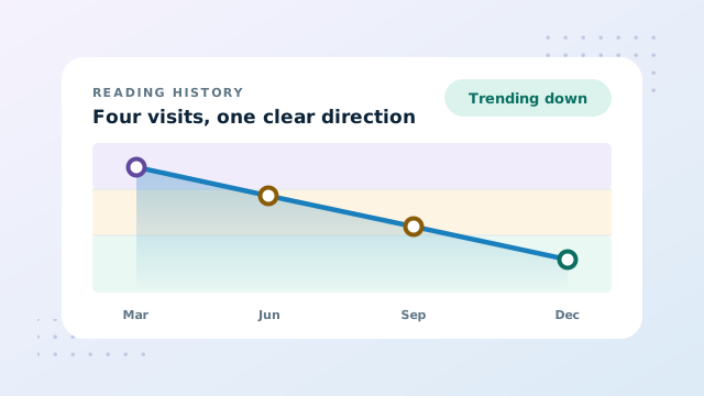
The trend chart plots only the readings you supplied. It never invents points between them, because what happened in the gap between two laboratory visits is genuinely unknown and drawing a smooth curve through it would imply knowledge nobody has.
Shaded bands sit behind the line to show the general reference ranges, and each marker takes the colour of the band it falls in. That means you can see at a glance not just whether a value moved, but whether it crossed a threshold.
- Switch the metric buttons to view the same data as a percentage, in mg/dL, or in mmol/L.
- Hover a point, or focus the chart and use the arrow keys, to inspect any single reading.
- Add a personal target to draw a dashed reference line across the whole plot.
- A single reading appears as one marker rather than a line, which is correct rather than a fault.
What the change column means
Beside each row the table shows movement from the previous dated reading, measured in A1C percentage points. A value of plus zero point four means the result rose by four tenths of a percentage point since the reading before it. The earliest entry has no predecessor, so it is marked as the first.
| Change shown | What it means | How much weight to give it |
|---|---|---|
| Under 0.2 | Within normal assay and biological variation | Rarely meaningful alone |
| 0.2 to 0.4 | A small move that may or may not be real | Watch the next result |
| Above 0.5 | A change large enough to notice | Worth discussing |
| Same direction three times | A sustained trend rather than noise | The signal that matters |
Direction repeated across several visits carries far more information than the size of any one step. A run of small moves all pointing the same way tells you more than a single large jump.
Keeping the record honest
A trend is only as good as the data behind it, and there are a few habits that keep it trustworthy over years rather than months.
- Enter results from the report. Memory reliably keeps the best and worst figures and quietly loses the ordinary ones in between, which are exactly the readings that define a trend.
- Use the note field for context. A new medication, a period of illness, a change of laboratory. These explain future surprises.
- Do not delete inconvenient results. A reading that breaks the pattern usually carries the most information in the whole set.
- Add each result as it arrives. Batching them up later is how collection dates get guessed at.
Turning it into a report
Once your readings are in, the report section produces a printable summary containing the latest values, the reference scale, the colour chart, and the full table. You can send it to a printer or download it as a PDF, and both routes produce an identical layout because they share one stylesheet.
Handing that page over at the start of an appointment lets the conversation begin with interpretation rather than reconstruction. Pair it with our guide to reading A1C results, and review the factors affecting A1C so useful context is recorded beside each test.
A note on storage
Nothing is saved unless you tick the option to remember entries on the device, which is deliberately off by default so that a shared or public computer keeps no trace. If you do turn it on, the record lives in your own browser and one control removes it again. Keeping that copy yourself preserves the full history when clinics, portals or devices change.
Conclusion: Building An A1C Trend Chart
Collect the collection dates, enter every result in whatever unit it arrived in, and let the chart show you the slope. Judge direction across several visits rather than the size of a single step, keep short notes about anything unusual, and print the report before each appointment.
Open the history mode and add your first dated reading.