How To Read A1C Results Without Guesswork
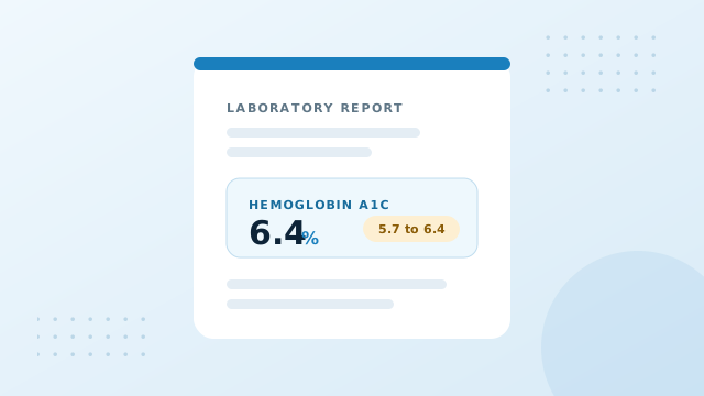
A laboratory report can feel dense the first time you open one. A single percentage sits on the page with almost no explanation beside it, and the number rarely resembles anything you see on a home meter. This guide unpacks what that figure actually describes, so you can look at your own result and understand the story it is telling rather than guessing at it.
What the percentage is actually counting
Most laboratory values report a concentration. So many units of something in so much blood. The A1C test does something different, and that difference explains almost everything that confuses people about it.
Why hemoglobin is involved at all
Glucose travels through your bloodstream continuously. As it moves, a small share of it attaches to hemoglobin, the protein inside red blood cells that carries oxygen around the body. That attachment is not an active process that your body controls or reverses. It happens passively, in proportion to how much glucose is present, and once the bond forms it stays put for the remaining life of that cell.
The A1C test measures what share of your hemoglobin is carrying that coating. Because it reports a share rather than an amount, the answer arrives as a percentage. A result of 6.2 percent means roughly six in every hundred hemoglobin molecules are carrying attached glucose.
Why the answer spans months
Red blood cells are replaced continuously, and a typical cell survives somewhere close to three months. At any moment your bloodstream holds a mixture of brand new cells, middle aged cells, and cells approaching the end of their run. The new arrivals carry very little coating. The older ones carry the accumulated record of everything they have travelled through.
Measuring the whole mixture therefore produces a weighted average stretching back across that lifespan. Recent weeks influence the figure more strongly than older ones, because more of the currently circulating cells were present for them, but the whole span contributes.
This is the property clinicians value. One difficult meal cannot move it. One restless night cannot move it. Even a stressful fortnight barely registers. What does move it is a sustained change in the average level your bloodstream sits at.
Why it never matches your meter
People frequently expect their A1C to confirm what their meter has been showing, then feel unsettled when it lands somewhere else. The gap is usually not an error. It follows from the two tests answering different questions.
A finger stick captures one instant, and in practice that instant tends to repeat. Most people test at broadly similar times, often before breakfast or before a meal. An average built from those readings describes one recurring slice of a day rather than the whole of it. The hours after eating, which frequently carry the highest values, may be barely represented.
Variability is the second reason. Two people can arrive at exactly the same average by very different routes. One drifts gently around the middle all day. The other swings between highs and lows that cancel out arithmetically. An A1C reports the same figure for both, because the average is genuinely the same even though the days are not.
This is precisely why the estimated average glucose figure exists. It restates your A1C in the units your meter speaks, so the two finally sit in one language and any gap becomes visible instead of theoretical. Our guide to estimated average glucose covers the conversion in detail.
Placing your number on the reference scale
Screening guidance for adults groups results into three broad bands. The table below shows those bands alongside the average glucose each boundary corresponds to, which is often more intuitive than the percentage on its own.
| A1C range | eAG mg/dL | eAG mmol/L | How guidance describes it |
|---|---|---|---|
| Below 5.7% | Under 117 | Under 6.5 | Below the prediabetes threshold |
| 5.7% to 6.4% | 117 to 137 | 6.5 to 7.6 | Prediabetes reference range |
| 6.5% and above | 140 and above | 7.8 and above | Diabetes threshold range |
Treat these bands as signposts rather than verdicts. They describe where a number falls on a population scale drawn from large groups. What that position means for one particular person depends on age, medical history, current medication, pregnancy status, and several factors no single figure can capture. Confirmation testing is normally required before any conclusion is reached.
It is also worth noticing how close the boundaries sit to one another. The entire prediabetes band spans seven tenths of a percentage point. Small movements therefore change the label attached to a result more dramatically than they change the underlying biology.
Read the direction, not only the dot
One result is a snapshot. Three or four results collected across a year form a line, and the slope of that line usually carries more meaning than any single point along it. Consider two people who both received a 6.2 percent result this morning.
| Visit | Person A | Person B |
|---|---|---|
| March | 6.9% | 5.5% |
| July | 6.6% | 5.8% |
| November | 6.4% | 6.0% |
| Today | 6.2% | 6.2% |
| Direction | Easing downward | Climbing steadily |
The figure on today's report is identical. The conversation each person should be having is not. Reading only the latest value discards the most useful information available.
Entering your dated results into the history mode of the calculator draws that line for you and reports the change between consecutive readings in percentage points. Our guide on building a trend you can use walks through the mechanics of assembling one properly.
What a single result cannot tell you
Being clear about the limits protects you from over reading a number.
- It cannot show your daily pattern. Two people with matching results can experience very different days. The average hides the shape.
- It cannot confirm a diagnosis on its own. Screening thresholds prompt further testing rather than conclude anything.
- It cannot account for your individual biology. Several ordinary conditions shift the relationship between glucose and the measured percentage.
- It cannot describe the last two weeks alone. Recent effort matters, but it is diluted across the whole cell lifespan.
That third point deserves particular attention. Anemia, pregnancy, recent blood loss, kidney conditions and inherited hemoglobin variants can all move a result away from what daily glucose would suggest. Our guide on factors that shift a result explains the mechanism behind each one.
A short checklist before your appointment
Arriving organised turns a brief consultation into a far more productive one.
- Write the collection date beside every result, not the date you received it.
- Note anything unusual in the months before the draw, such as illness, surgery, blood donation or a medication change.
- Bring the printed report rather than a remembered figure.
- Convert each result so you can discuss it in whichever unit feels natural to you.
- Have a specific question ready rather than waiting to be told something.
Our guide to building an A1C trend chart pairs well with a printed report, while factors affecting A1C explains which details are worth recording around the test date.
Common ways people misread the number
Treating a small change as meaningful
Laboratory methods carry their own margin, and biological variation adds more. A shift of a tenth or two between visits rarely signals anything by itself. Sustained direction across several results is the signal worth discussing.
Comparing results from different laboratories
Methods vary slightly between providers. If you switched clinics between tests, that is worth mentioning, particularly when a result looks out of step with the pattern you have built.
Assuming the percentage is a glucose value
A result of 7.0 does not mean a blood glucose of seven anything. It corresponds to roughly 154 mg/dL or 8.6 mmol/L. Confusing the scales is one of the most common misreadings and the easiest to fix by converting.
Conclusion: How To Read A1C Results
Your A1C is a long exposure photograph of your bloodstream rather than a single frame. Read it alongside its estimated average glucose twin so the units make sense, place it on the reference scale for context, then look at where the line has been heading across visits. That combination gives you far more insight than staring at one percentage in isolation.
When your next result arrives, open the calculator, enter it with its date, and let the chart do the comparison work for you.